Story Behind Grovia
I first discovered focus apps during a period when I struggled with motivation. No matter how much I worked, it never felt enough. Even after hours of effort, I was trapped in the illusion that I hadn’t really done much at all. That’s when I turned to productivity apps&tools that could help me stay on track and measure where my time was actually going.
While they offered useful benefits like time tracking and structure, every app I tried left me with the same feeling: something was missing. None of them gave me the sense of joy or fulfillment I was looking for.
That’s when I decided to dig deeper. I conducted a broader market analysis and began exploring how I could design a better, more engaging solution.
First thing first, I analyzed the existing focus app market to understand what they do well and where they fall short.
This quick scan revealed a consistent pattern: apps can help you start, but they rarely keep you coming back.
Forest

Flora
Pomodoro Timers

Focusmate
This quick scan revealed a consistent pattern: apps can help you start, but they rarely keep you coming back.
I created a post in the community of the app I used the most. Sharing my thoughts, early ideas, and asking others what they thought.
As a frequent user myself, I knew I couldn’t be the only one struggling with these frustrations. That post not only sparked an active discussion, but also helped me connect with regular users who later became valuable voices in one-on-one conversations.
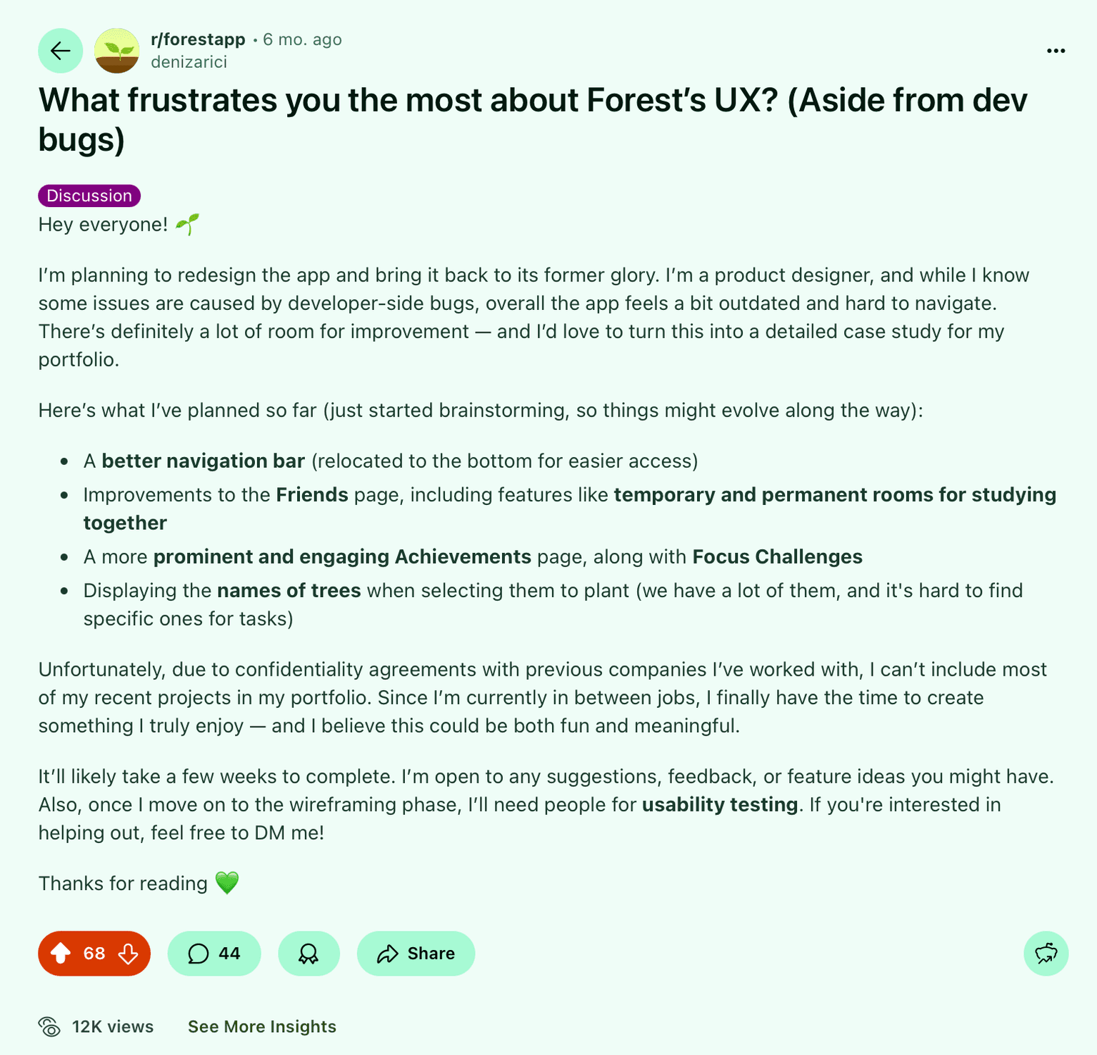
The responses I received immediately revealed the exact pain points I had experienced myself and much more.
I think it's a great idea. The app needs an urgent refresh and some small improvements. Besides, I think a night/ dark mode can be perfect, especially for those who focus at night. I'd love to give you an help, if you need!
Search and sorting 😅 I wish we could search the friends list and sort people there. I have 600+ people in the list and it's absolutely unusable. Also finding a specific date in the timeline would be so helpful
The tree name thing is my biggest one. Also that delay while waiting for the focus challenges to load.
I use the app for tracking my studying and I do this via the tags. I have at least 20 of them and it is super annoying to try to find the ones I need, because sometimes the ones I used recently are at the start, but sometimes the tags are sorted chronologically (aka the ones created first are at the start)... Sometimes it appears to be totally random. I really like the idea of study rooms btw. The community aspect is pretty much useless as you either need to add friends, or you get shown bot accounts that have the app turned on 24/7 as "best ranking" and they use it to marker shady discords.
The original post received 68 upvotes and a total of 44 comments, including my own follow-ups. This level of engagement validated that the challenges I had identified resonated widely within the community. From those who engaged, I also reached out to several individuals for one-on-one conversations, which provided deeper insights into their usage patterns. You can view the original post here.
Using both the feedback I collected and my own design planning, I defined the key pain points and created corresponding solutions around them.
Lack of freedom & personalization
Pain Point: People wanted to shape their environment, name and arrange elements, and feel a stronger sense of ownership.
Solution: A customizable "Land" where users can freely arrange and name trees, choose themes, backgrounds, and adjust animations for making the environment truly theirs.
Limited data visibility & control
Pain Point: Productivity tools should provide clarity—exporting history, finding information quickly, and staying organized.
Solution: Export to Excel/CSV, advanced search, filters, and tag management give users clear insights and full ownership of their focus history.
Motivation fades after initial excitement
Pain Point: Users needed a dynamic system that sustains engagement and creates long-term consistency.
Solution: A multi-layered system with Season Pass, Tiered Achievements, and a meaningful economy (Spendables & collectibles), supported by widgets and streak reminders for daily motivation.
Weak community connection
Pain Point: Focusing with others should create accountability without distraction or spam.
Solution: Study Rooms and authentic challenges enable "together, quietly" focus—light-touch social presence that motivates without overload.
Visual monotony over time
Pain Point: Visual environments need to evolve and stay fresh to maintain excitement.
Solution: Seasonal themes, alternative grasses, and background variety keep the experience visually engaging and rewarding.
Outdated & clunky UX
Pain Point: A modern productivity tool must feel intuitive, smooth, and frictionless.
Solution: A streamlined interface with simplified flows, quick-access menus, and lighter motion options for effortless daily use.
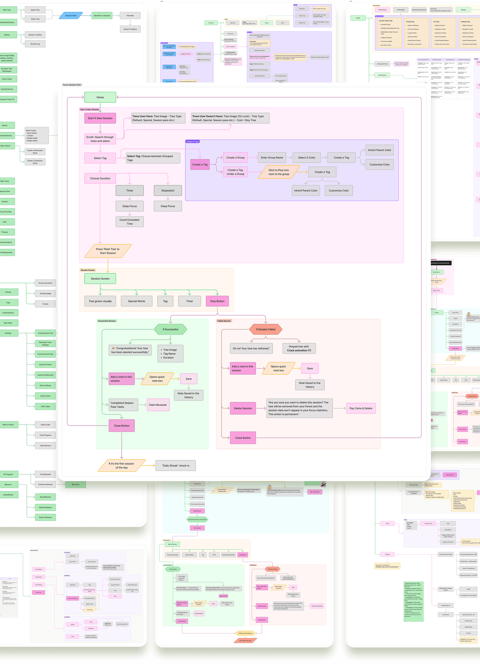
After identifying key opportunities, I began shaping Grovia’s foundation, transforming abstract ideas into tangible flows and connections.
I created detailed sitemaps and user journey maps to visualize how each component from Focus Sessions to Study Rooms, Season Pass, and Profile systems, interact within the product. These diagrams represent the early structure of Grovia’s ecosystem, serving as a guide for upcoming design iterations and feature refinements.
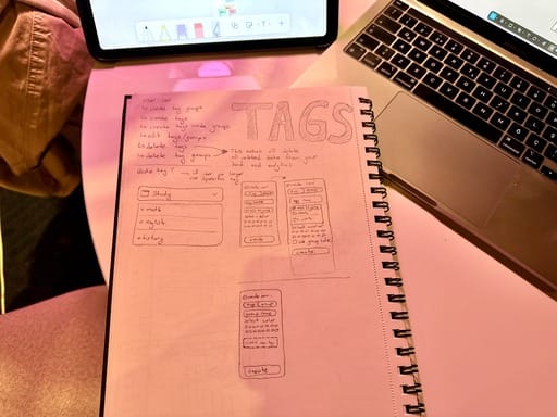
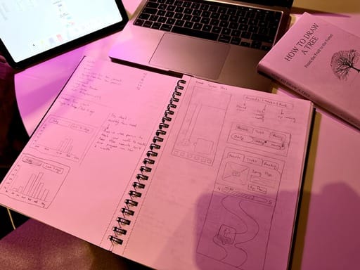
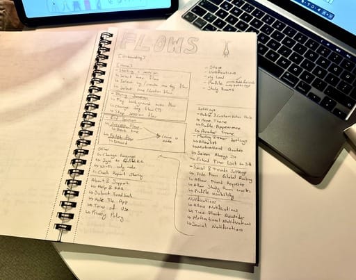
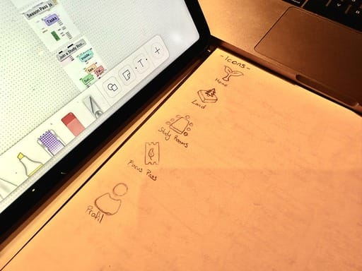
Alongside the digital mapping process, I also sketched ideas by hand for testing different flow possibilities, layouts, and interactions on paper.
These quick notes and drawings helped me think more freely and refine the overall structure before moving forward with detailed wireframes.
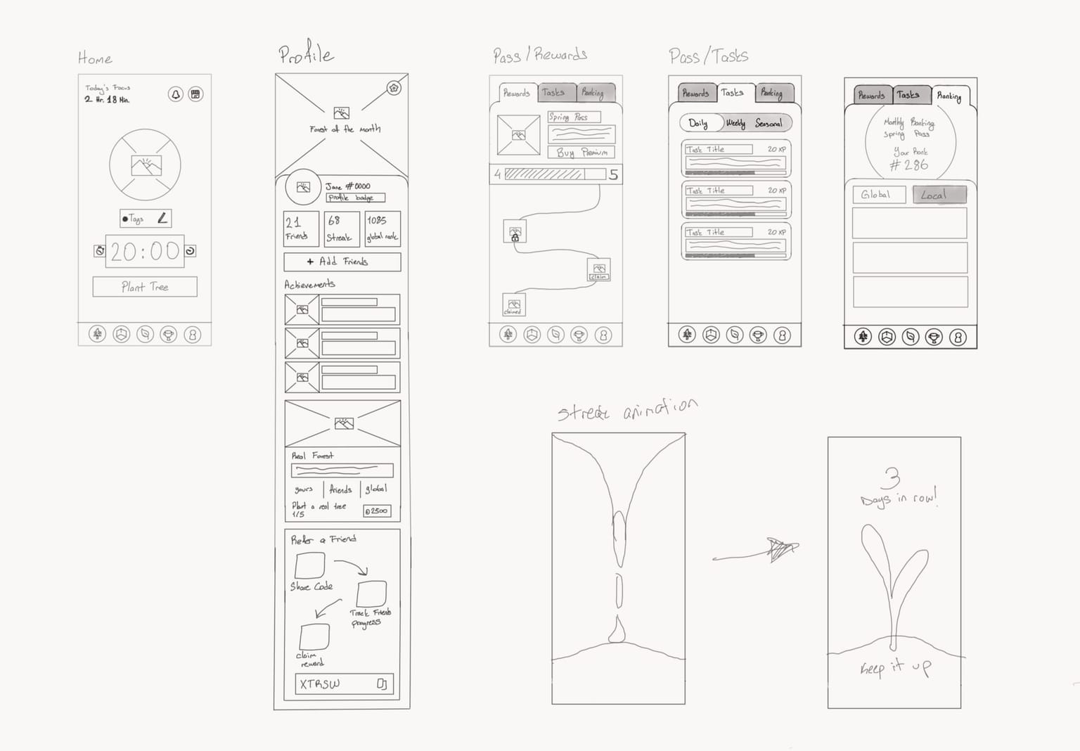
With these foundational elements in place, I moved on to creating detailed wireframes for each screen and interaction.
At this stage, I focused on shaping the experience before any visuals starting with onboarding, the first and most critical touchpoint. The goal was to make users feel emotionally invested even before signing up, creating a sense of connection and purpose from their very first interaction.
I also planned the onboarding flow with analytics integration in mind, allowing future insights into user motivations, demographics, and the conditions under which they download the app.
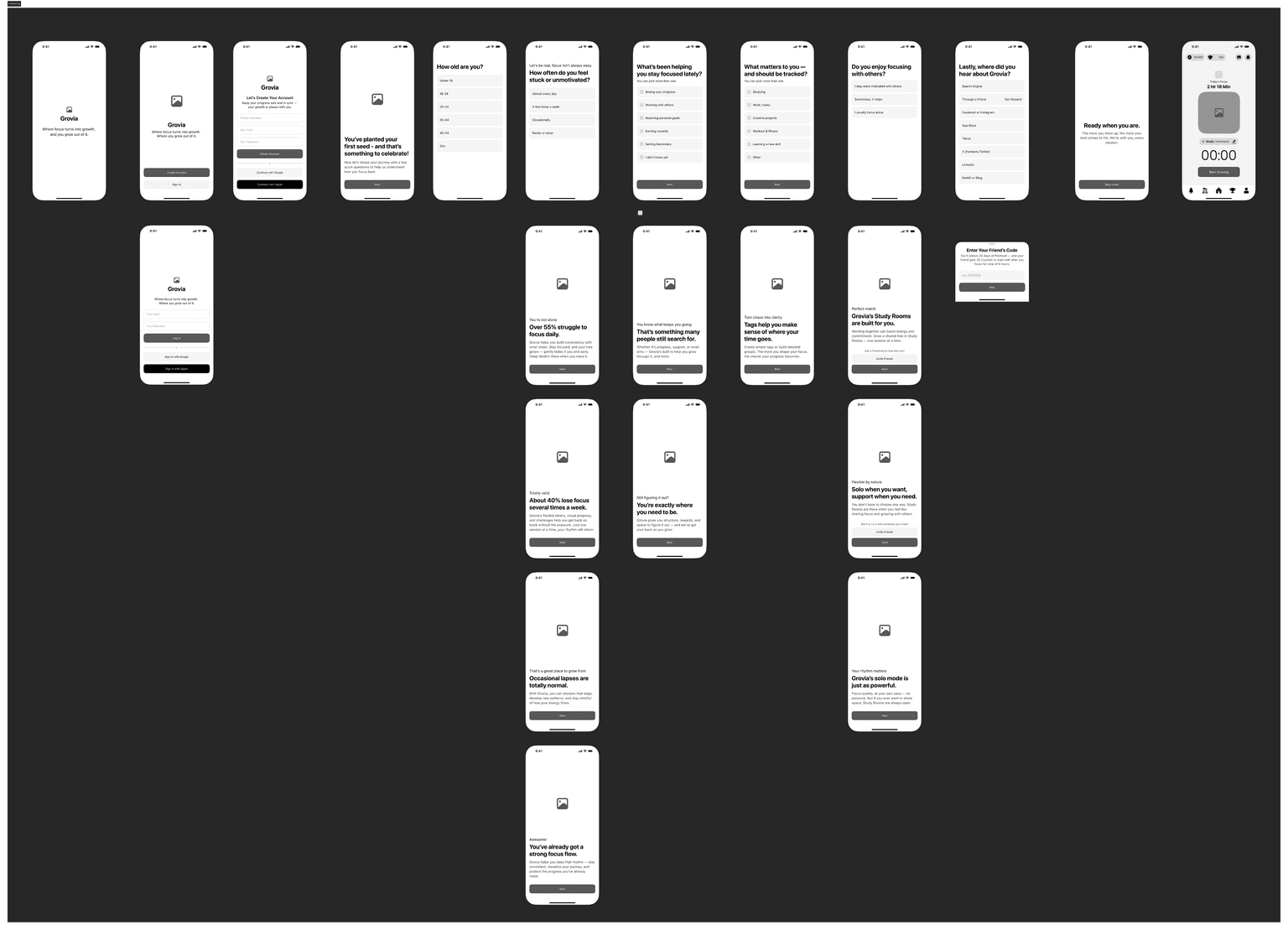
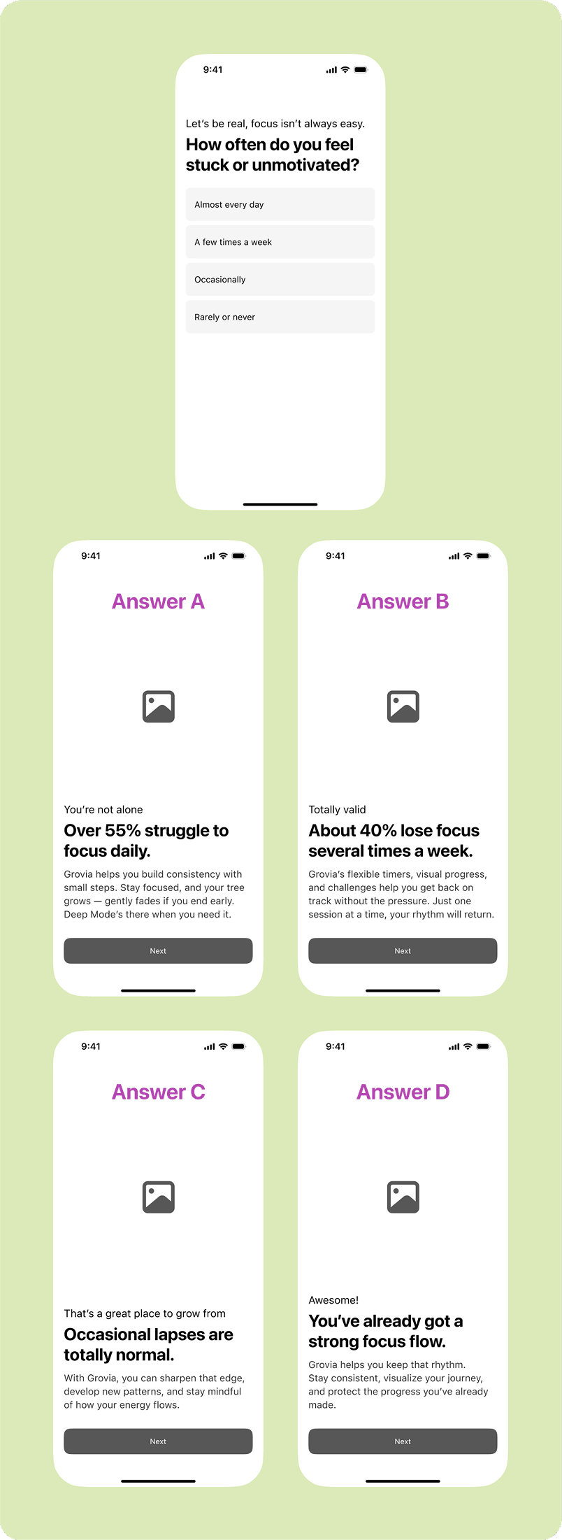
Each answer within the onboarding survey triggers personalized responses, making the flow feel more like a genuine conversation than a form.
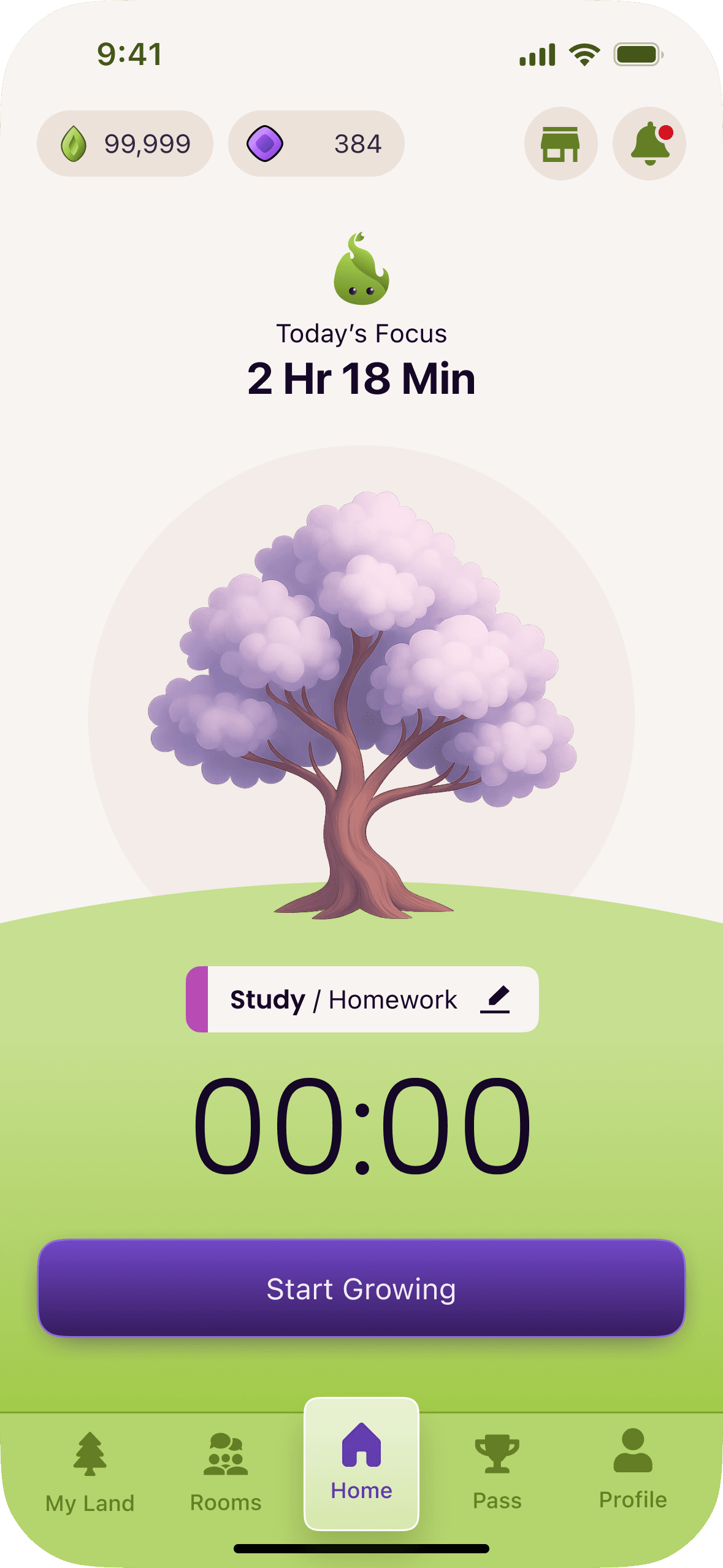
The focus session represents the core experience of Grovia, the very reason users download the app. Since this action is repeated multiple times a day, I aimed to simplify it as much as possible while still keeping it functional and rewarding.
Before starting a session, users can preview all available trees with their names and see the ones they don’t own as locked, linking them to the shop if they wish to unlock them. They can group and color-code tags, freely organize them, and easily find what they need using a search box on every step, avoiding long scrolling.
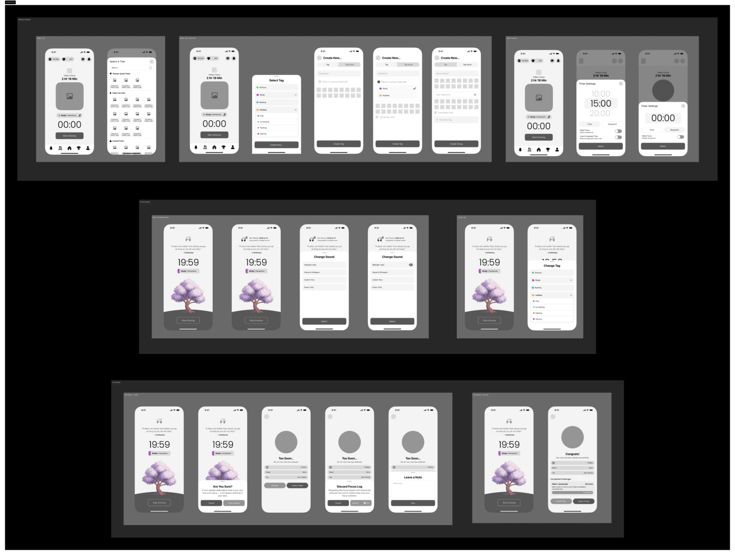
I explored several variations to make sure that everything a user might need before starting a focus session is accessible in one place. The flow also covers both successful and failed sessions, giving users feedback and emotional continuity, whether they grow their tree or see it wither.
This stage allowed me to test hierarchy, interaction patterns, and different UI behaviors to make the process effortless and intuitive.
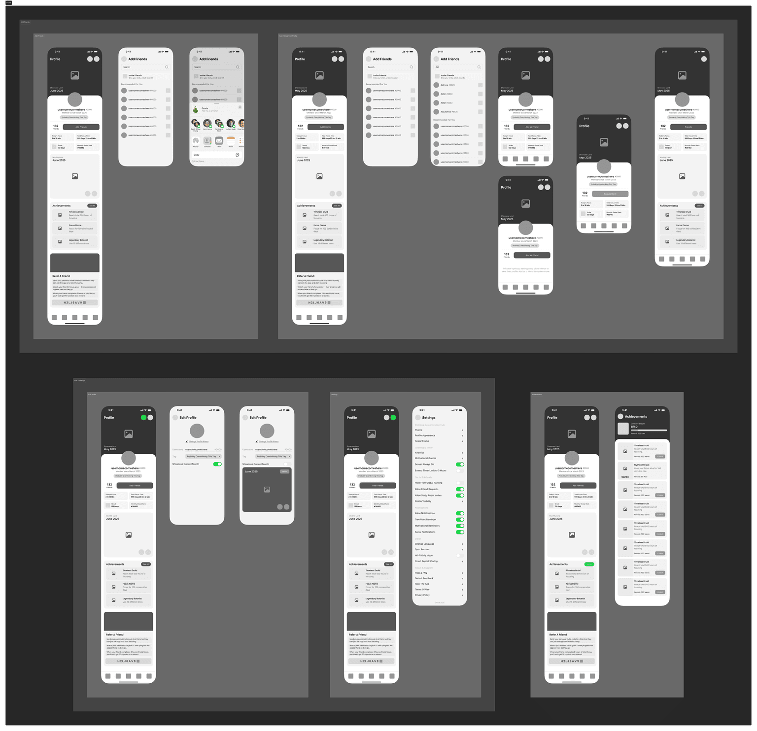
The profile serves as a personalized hub where users can view their friends, add new ones, and showcase their achievements, trophies, and custom-designed Monthly Land.
It also displays each user’s total focus time since account creation, their daily focus duration, their current rank and current streak, giving a quick overview of long-term progress and consistency.
From here, users can access all personalization options and settings, making it simple to customize their experience in one place.
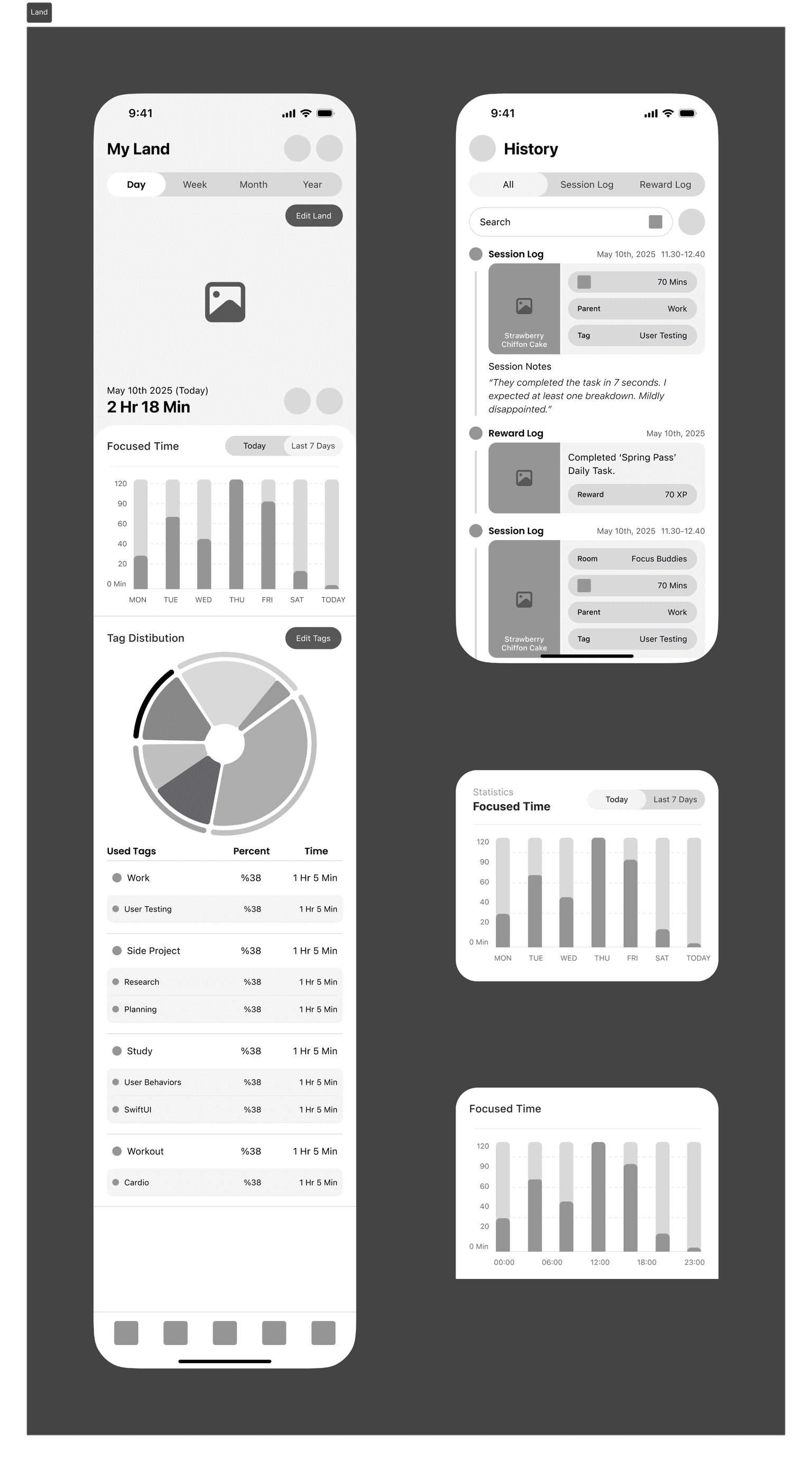
This section is one of the most essential parts of the app, it’s where users see the results of their effort.
Here, they can view all the trees they’ve planted and use the “Edit Land” feature to freely arrange them on the ground, creating their own patterns and layouts.
The page also displays detailed focus analytics, allowing users to compare their focus duration across days, weeks, or months, and track their progress visually.
From the History panel, they can review all past focus sessions and notes in one place.
I’m still refining this area to give users the most insightful and rewarding experience possible. The visual shown here represents the first working prototype of this feature.
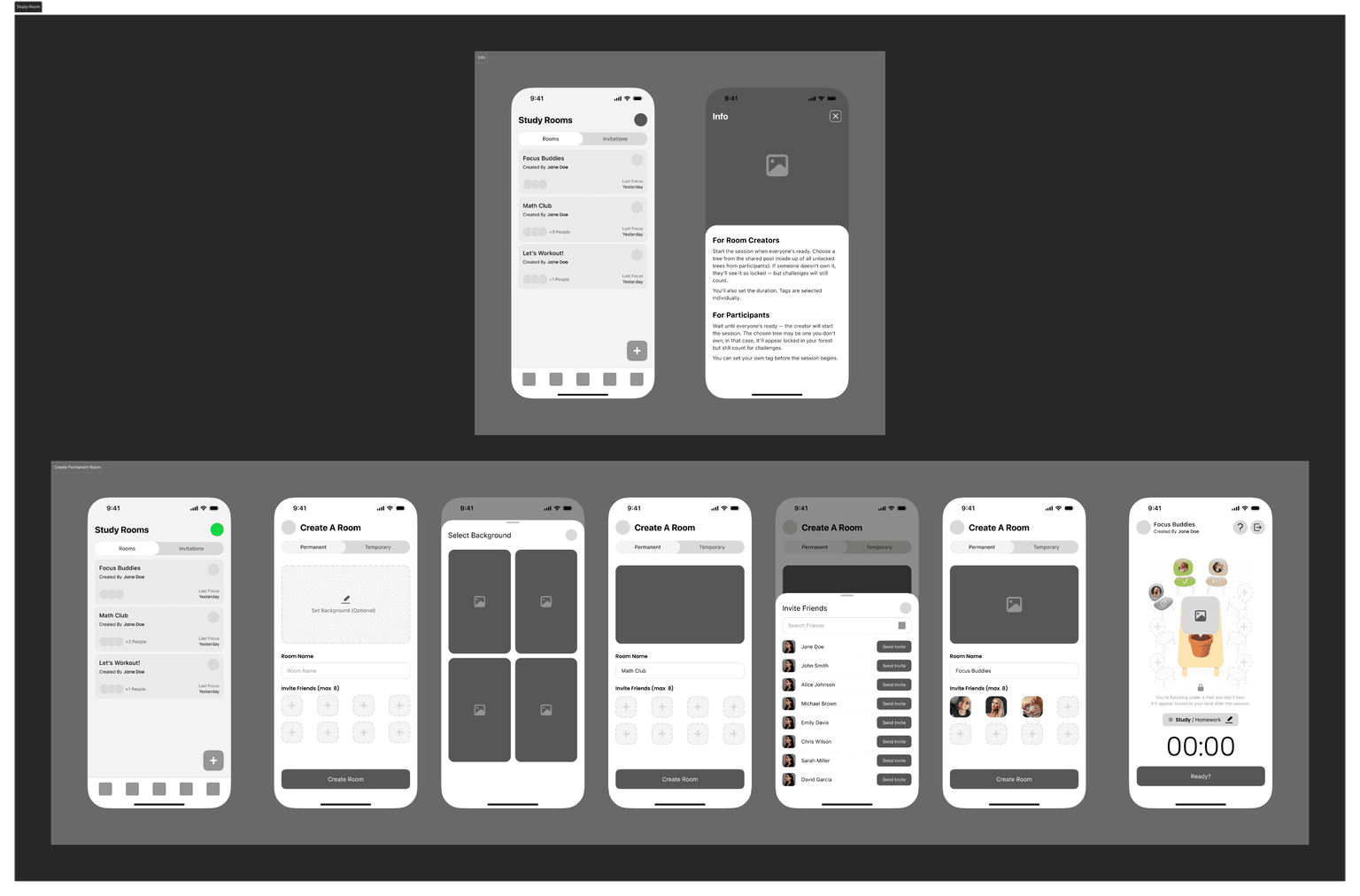
Inspired by the idea of studying at the same table with a friend miles away, Study Rooms recreate that shared experience in a focused and minimal way.
Even though Grovia doesn’t include direct messaging, I wanted users to still feel a sense of social presence and togetherness.
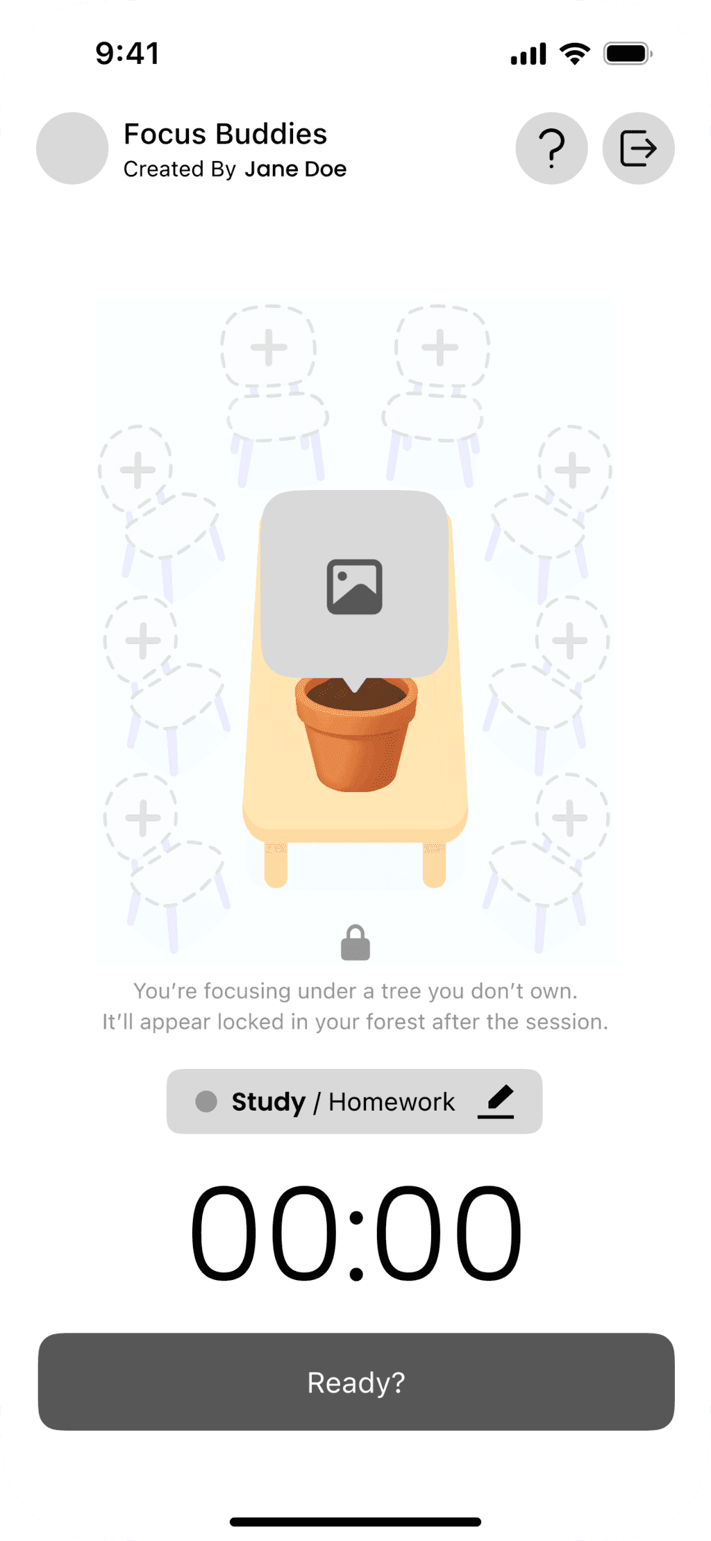
Users can create permanent or temporary rooms, join friends, and focus together around a virtual table where the tree they plant grows in the center as a symbol of shared virtual table where the tree they plant grows in the center as a symbol of shared progress. Each member can work on their own tag while contributing to a collective boost, and those who complete their tasks can unlock rewards or achievements.
This feature was designed to bring gentle social motivation into the app without disrupting the calm, individual focus experience.
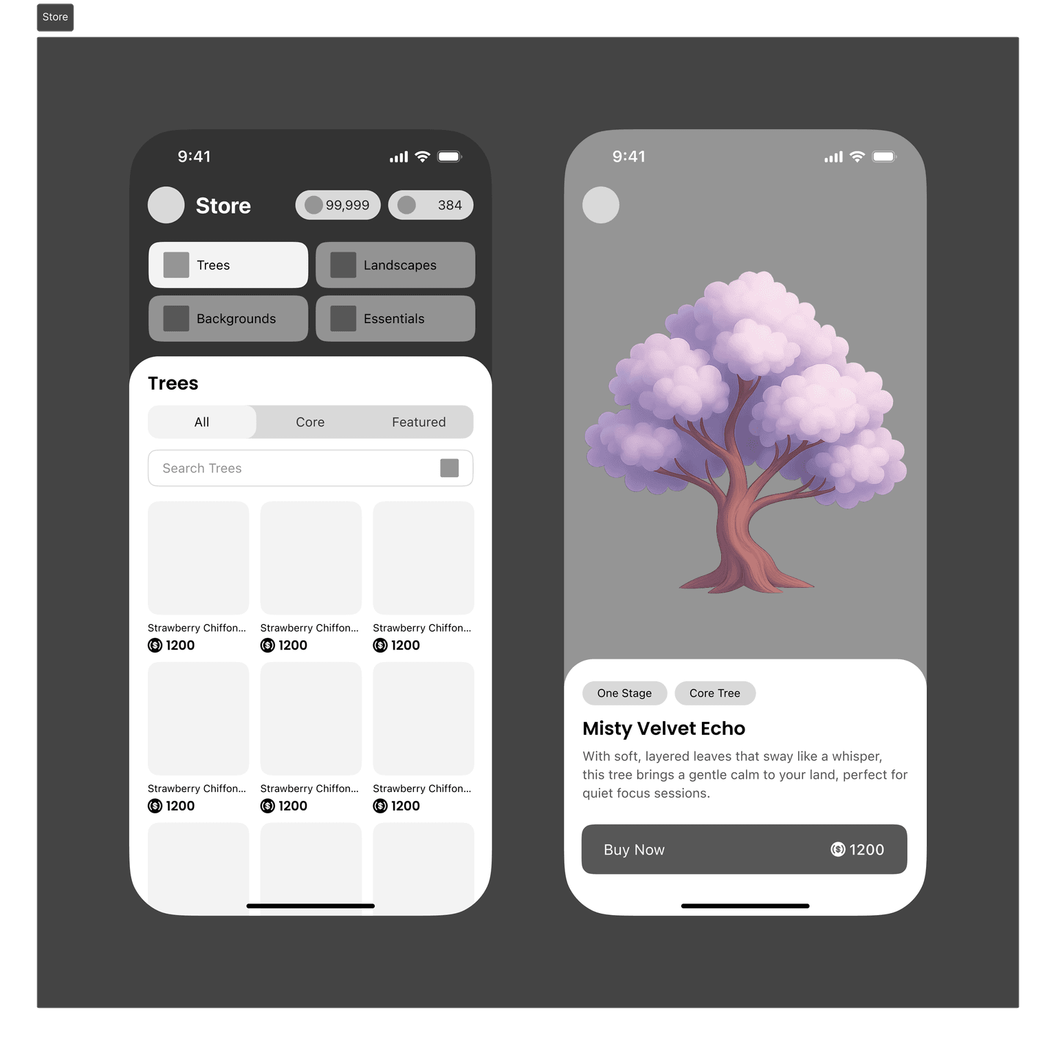
The store is built around simplicity and speed. I wanted users to find anything they need; trees, landscapes, or essentials in just a glance.
Detailed filters and search make it effortless to explore without endless scrolling, and every part of the layout is designed to keep the experience smooth and satisfying.
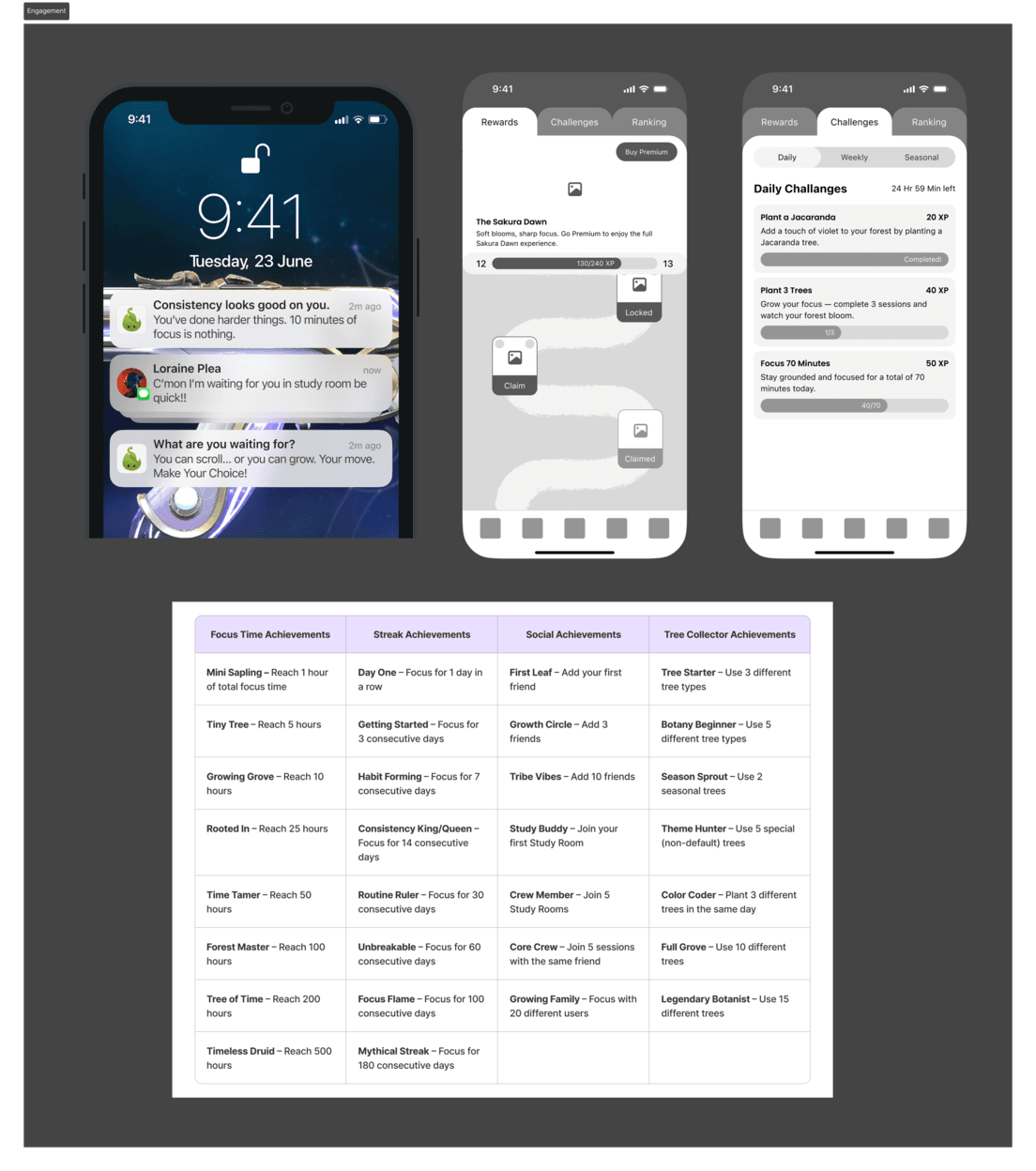
This is the part of Grovia that pushes back. The system built to keep users accountable and hungry for progress.
It’s designed to make focus feel rewarding, but also impossible to ignore. With a Season Pass full of challenges and time-limited rewards, an expanding list of achievements, and a daily streak that demands at least ten minutes of focus, users quickly learn that consistency pays off and skipping a day has a cost.
Paired with motivational widgets that nudge (and occasionally guilt-trip) users back into action, this system turns focus into a game you don’t want to lose.
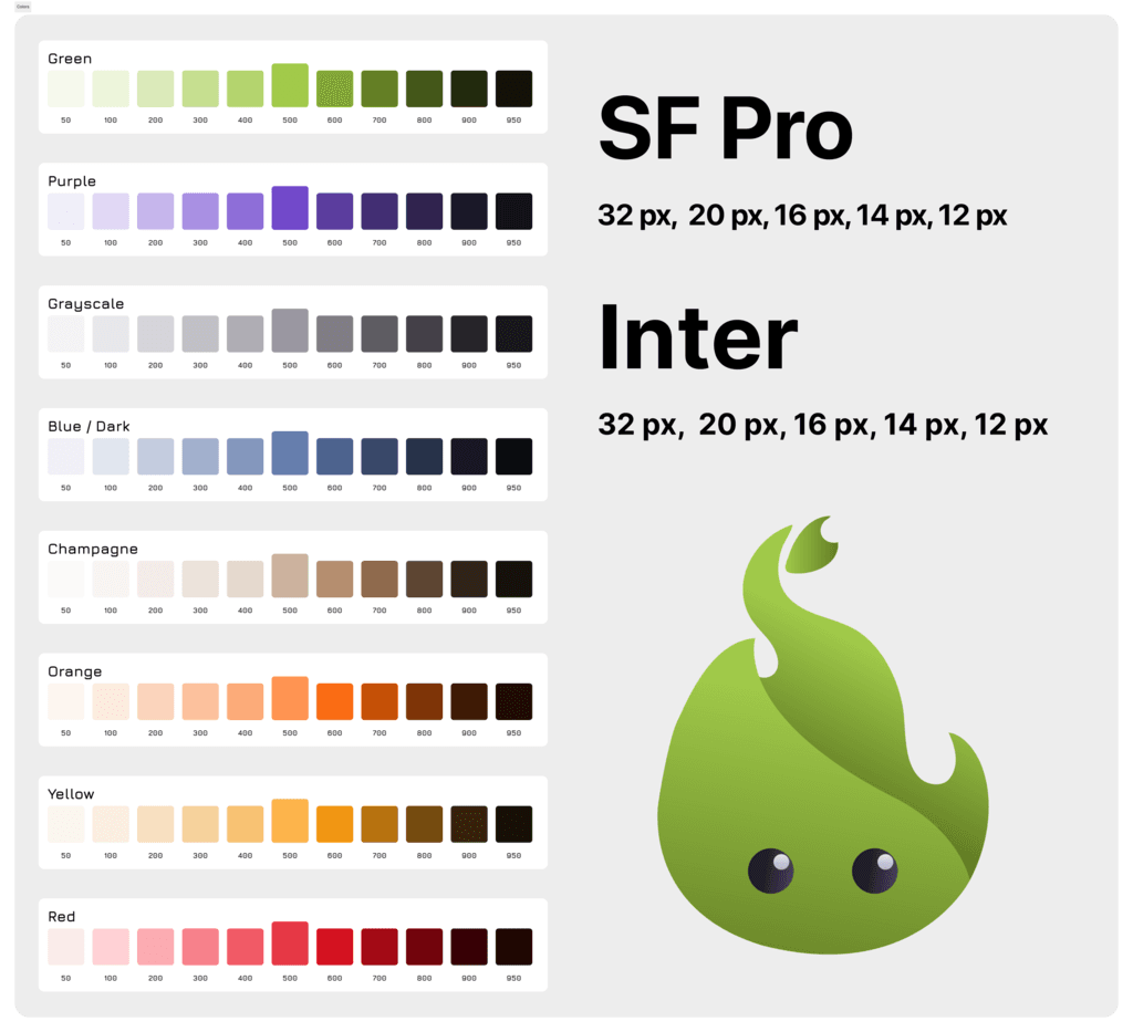
After completing the detailed wireframes and flows, I started building Grovia’s design system.
Choosing the right colors turned out to be one of the toughest parts — I kept coming back to the idea of growthrepresented by green, and focus reflected in purple. Finding the right balance between the two took some time, but I’m happy with where it landed.
I created a temporary logo as a reference point and defined separate font systems for iOS and Android — SF Pro and Inter — before finalizing the first version of Grovia’s design system.
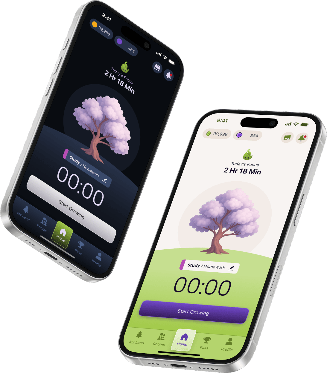
Using the foundation of my design system, I created the first visual merge with the existing wireframes, starting from the Home screen.
Even though it’s not the final version, this early exploration helped me better understand the product’s potential and how the system could come to life visually.
Grovia is still evolving, this means this stage marks just the beginning.
My next steps include refining all wireframes using the design system, polishing the visual language, and defining consistent patterns across every screen.
I also plan to explore micro-interactions, motion, and sound design to make every action feel more alive and emotionally connected. Future iterations will focus on expanding the experience beyond the phone; introducing smartwatch integration, new social layers, and a deeper reward system that grows with the user.
Grovia isn’t finished yet. It’s growing, just like the trees inside it.